---
title: Neon Auth Components
subtitle: Overview of Neon Auth pre-built components
enableTableOfContents: true
tag: beta
---
> Pre-built Next.js components to make your life easier
After setup, you can use these pre-built components to quickly add authentication features to your app.
For the full documentation of all available components, see the [components reference](/docs/neon-auth/components/components).
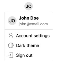
## UserButton
The `UserButton` component shows the user's avatar and opens a dropdown with various user settings on click.
 ```tsx
import { UserButton } from '@stackframe/stack';
export default function Page() {
return ;
}
```
## SignIn and SignUp
These components show a sign-in and sign-up form, respectively.
```tsx
import { UserButton } from '@stackframe/stack';
export default function Page() {
return ;
}
```
## SignIn and SignUp
These components show a sign-in and sign-up form, respectively.
 ```tsx
import { SignIn } from '@stackframe/stack';
export default function Page() {
return ;
}
```
All Neon Auth components are modular and built from smaller primitives. For example, the `SignIn` component is composed of:
- An `OAuthButtonGroup`, which itself is composed of multiple `OAuthButton` components
- A `MagicLinkSignIn`, which has a text field and calls `signInWithMagicLink()`
- A `CredentialSignIn`, which has two text fields and calls `signInWithCredential()`
You can use these components individually to build a custom sign-in experience.
To change the default sign-in URL to your own, see the documentation on [custom pages](/docs/neon-auth/customization/custom-pages).
## More Components
Neon Auth has many more components available. For a comprehensive list, see the [components reference](/docs/neon-auth/components).
```tsx
import { SignIn } from '@stackframe/stack';
export default function Page() {
return ;
}
```
All Neon Auth components are modular and built from smaller primitives. For example, the `SignIn` component is composed of:
- An `OAuthButtonGroup`, which itself is composed of multiple `OAuthButton` components
- A `MagicLinkSignIn`, which has a text field and calls `signInWithMagicLink()`
- A `CredentialSignIn`, which has two text fields and calls `signInWithCredential()`
You can use these components individually to build a custom sign-in experience.
To change the default sign-in URL to your own, see the documentation on [custom pages](/docs/neon-auth/customization/custom-pages).
## More Components
Neon Auth has many more components available. For a comprehensive list, see the [components reference](/docs/neon-auth/components).