


You’re already using Neon, so chances are you’ve got valuable application data sitting in your Postgres database that reflects how people interact with your product. This data can tell you a lot about your customers and help guide product decisions, whether you’re an engineer, a founder, or a product manager.
In this post (and the video below), I’ll walk you through how to analyze your Neon data using Fabi.ai. You can connect your Neon database, run your first AI data analysis, and turn it into a dashboard in just a few minutes:
About Fabi
Fabi.ai is an AI-native business intelligence platform built for teams that want to find better, faster insights to help drive their business growth, regardless of the team’s technical skill level. With Fabi.ai you can connect to any data source, ask questions in SQL, Python, or plain English, build charts, and push dashboards or automated workflows. Try the free plan.
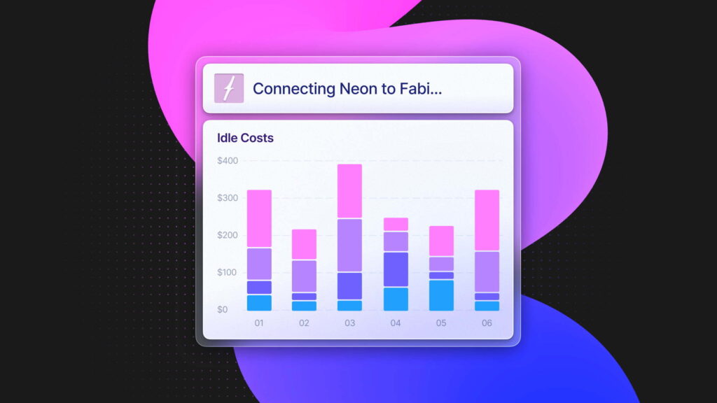
Connecting Neon to Fabi
The first step is connecting your Neon database to Fabi.
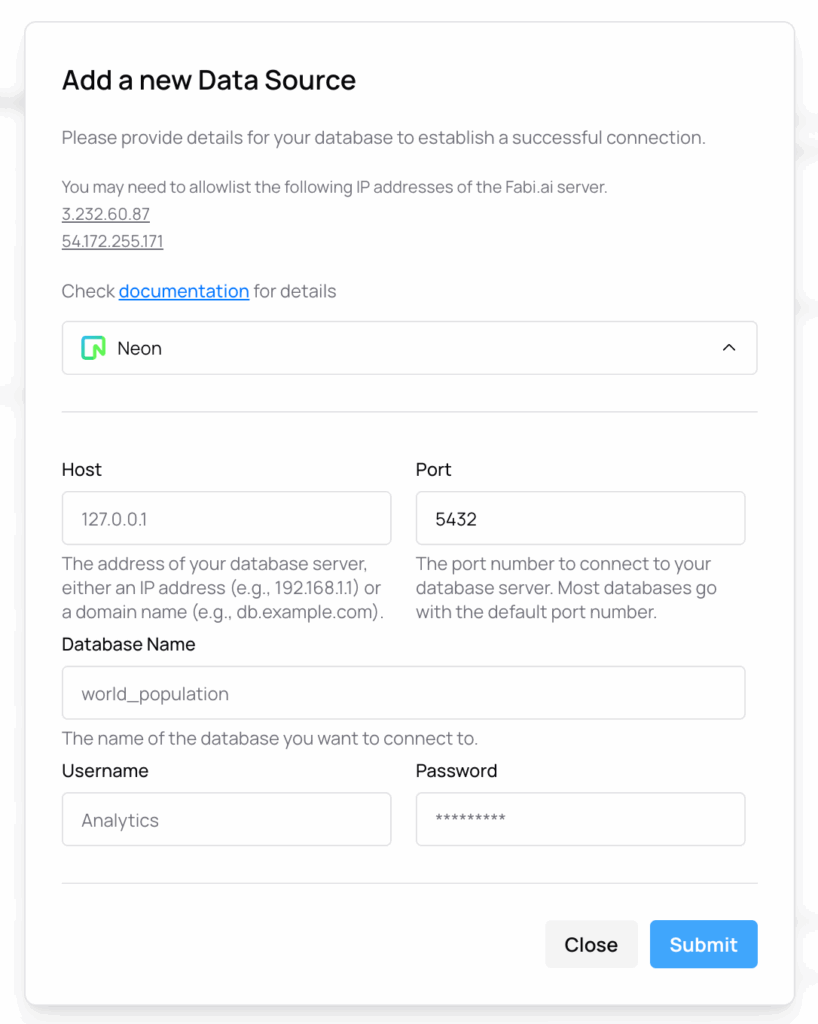
If you don’t already have a Fabi account, head over to Fabi.ai or go straight to app.fabi.ai to sign up. During onboarding, Fabi will prompt you to connect a data source; you can follow that flow, or, if you already have an account, open your workspace and follow these steps:
- In the left-hand sidebar, click Data Sources
- Hit Add Data Source, then search for and select Neon
- You’ll see a short form asking for your connection details: host, port, username, password, and database name
- Paste those into the Fabi connection form and submit.
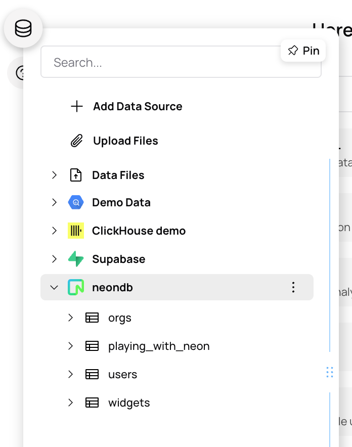
Once the connection is established, Fabi will automatically detect your schema and load your tables. In this example, I’ve got some synthetic product data in Neon with things like orgs, users, and widgets. You’ll see those same tables appear in Fabi as soon as the sync completes:
Your Neon database is now connected to Fabi, and you’re ready to start analyzing your data.
Exploring Your Data with Fabi’s AI Analyst Agent
Once your Neon data is connected, you can start exploring it right away using Fabi’s AI Analyst Agent, an interactive assistant that understands your schema and can query your database using plain English.
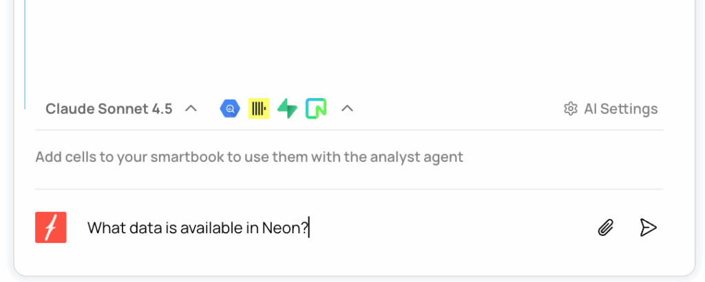
Let’s try it. On the right-hand side of your workspace, you’ll see the AI chat panel. You can start by asking a simple question like, “what data is available in Neon?”
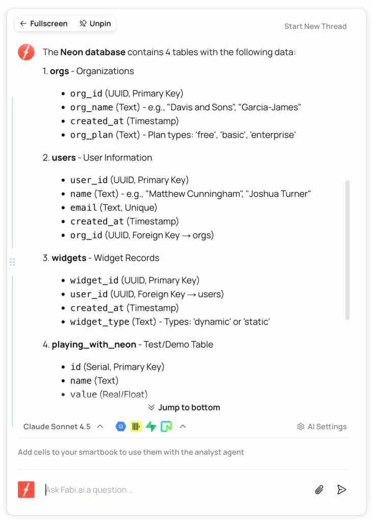
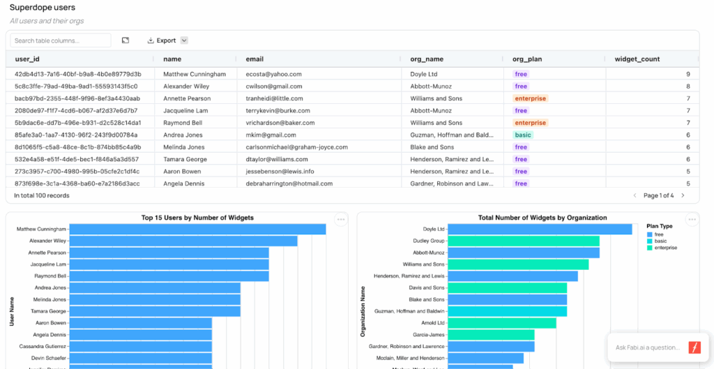
The agent will inspect your schema and reply with a summary. In my case, it found three tables: orgs, users, and widgets.
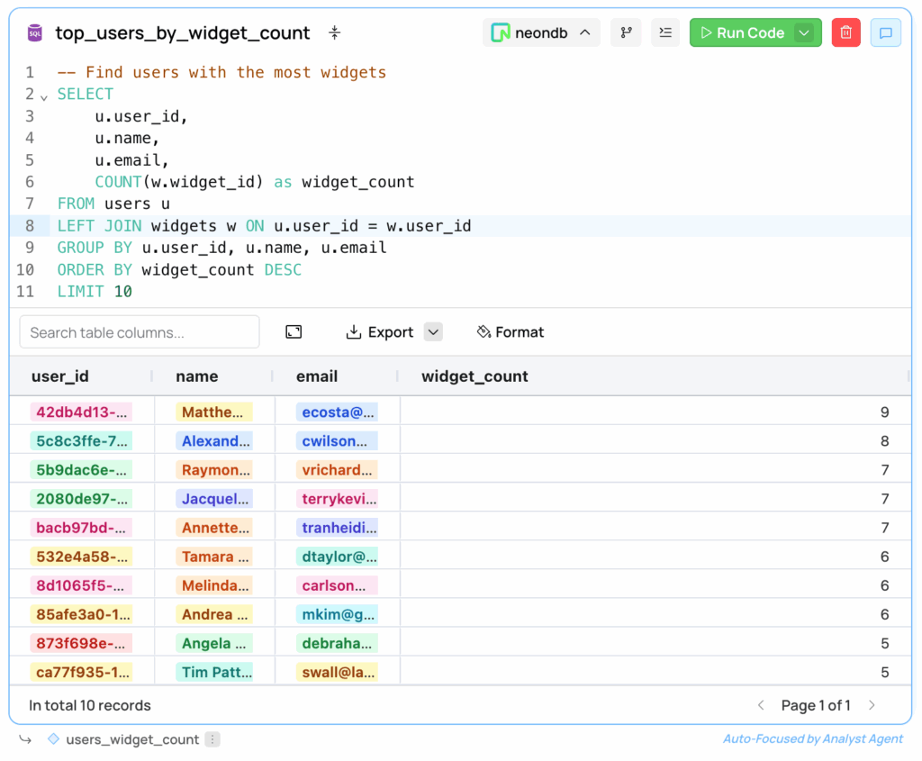
From there, you can start digging in. For example, let’s ask: “which users have the most widgets?” Here’s what we get:
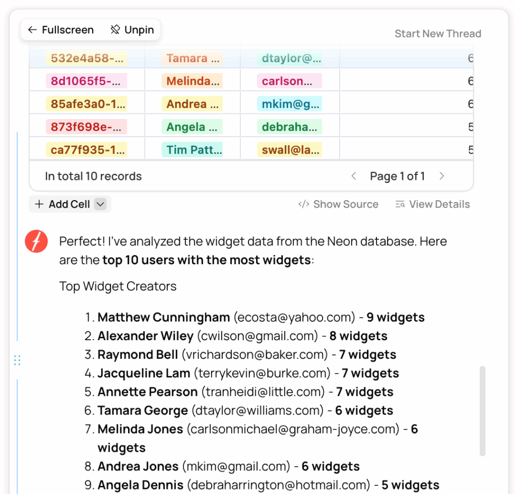
What’s happening behind the scenes: Fabi is automatically generating and running the SQL query against your Neon database, then returns a table and chart with the results. You don’t have to write any SQL yourself but you can save the AI suggestions and view the underlying query and edit it if you’d like:
You can also choose which AI model powers your session. At the moment of typing this, Claude Sonnet 4.5 is a great option for analytics use cases (fast and accurate) but Fabi keeps up with new models as they’re released.
Once you get a result you like, e.g. a table or chart, you can save it to your workspace for later use – Fabi calls these saved spaces Smartbooks.
Every time you save something in Fabi, it’s added to a Smartbook. You can think of a Smartbook as your all-in-one workspace: a place to run ad-hoc analysis, explore queries, and build dashboards or workflows.
Customizing your Smartbooks
When you ask the AI a question in plain English, Fabi not only gives you the answer, but also generates the full SQL and Python code behind it. You can view the code directly in the AI Analyst Agent interface:
- First a SQL cell querying your Neon data (for example, from the users table),
- Then Python cell that stores the results as a DataFrame and plots the data using Altair
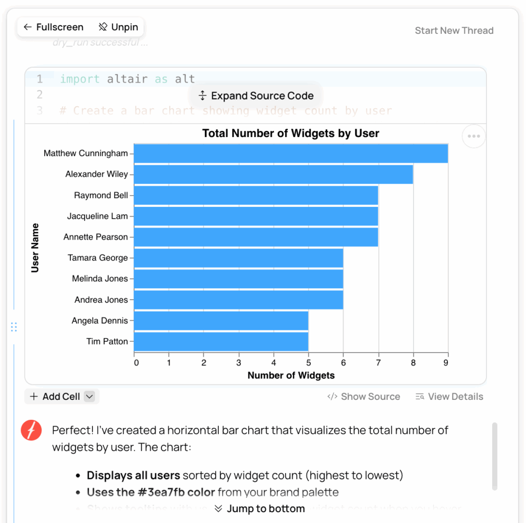
If you like the chart, just click Pin to Smartbook. Fabi will save the entire block so you can revisit or modify it later.
You can then customize it further. For example, you might say, “change the chart orientation and switch the color from green to red”, and the AI will regenerate the chart accordingly. You can keep iterating this way until your visualization looks exactly how you want.
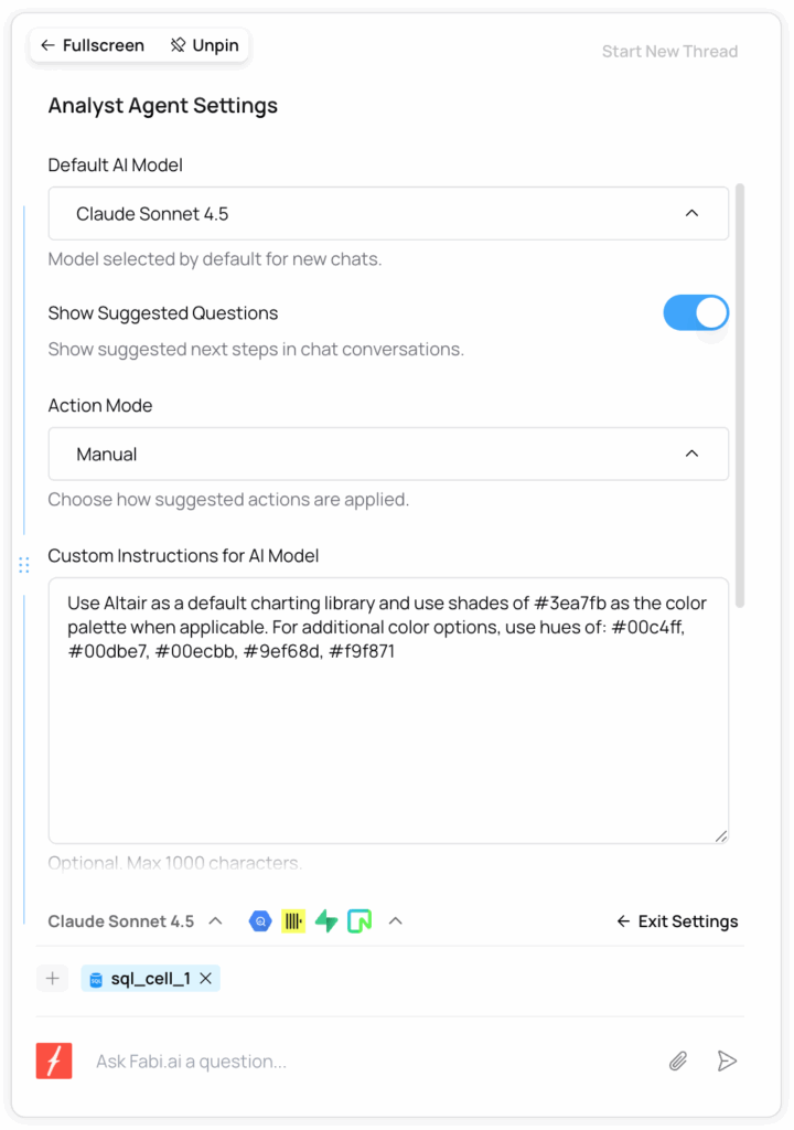
Another neat feature: you can edit your data semantics or AI settings to give Fabi more context. Under your Neon data source, click the three dots → Edit Semantics to describe your product or data model. Or open AI Settings to personalize the assistant: define your brand colors, preferred chart styles, or how you want metrics to be labeled.
Fabi also offers two different ways to view your Smartbook:
- Linear view, which feels familiar if you’ve used Jupyter notebooks – showing your code and charts in a simple top-down layout.
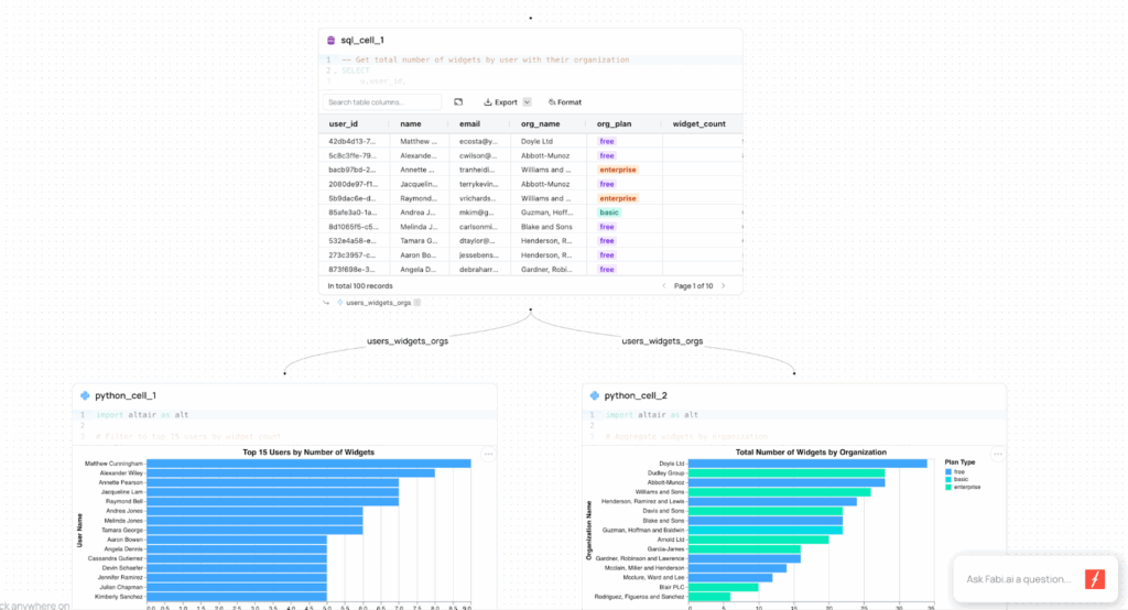
- Workflow view, which shows how each query and chart are connected. This is a great way to visualize dependencies between your datasets and visualizations.
Sharing and Automating Your Reports: From Smartbooks to Dashboards
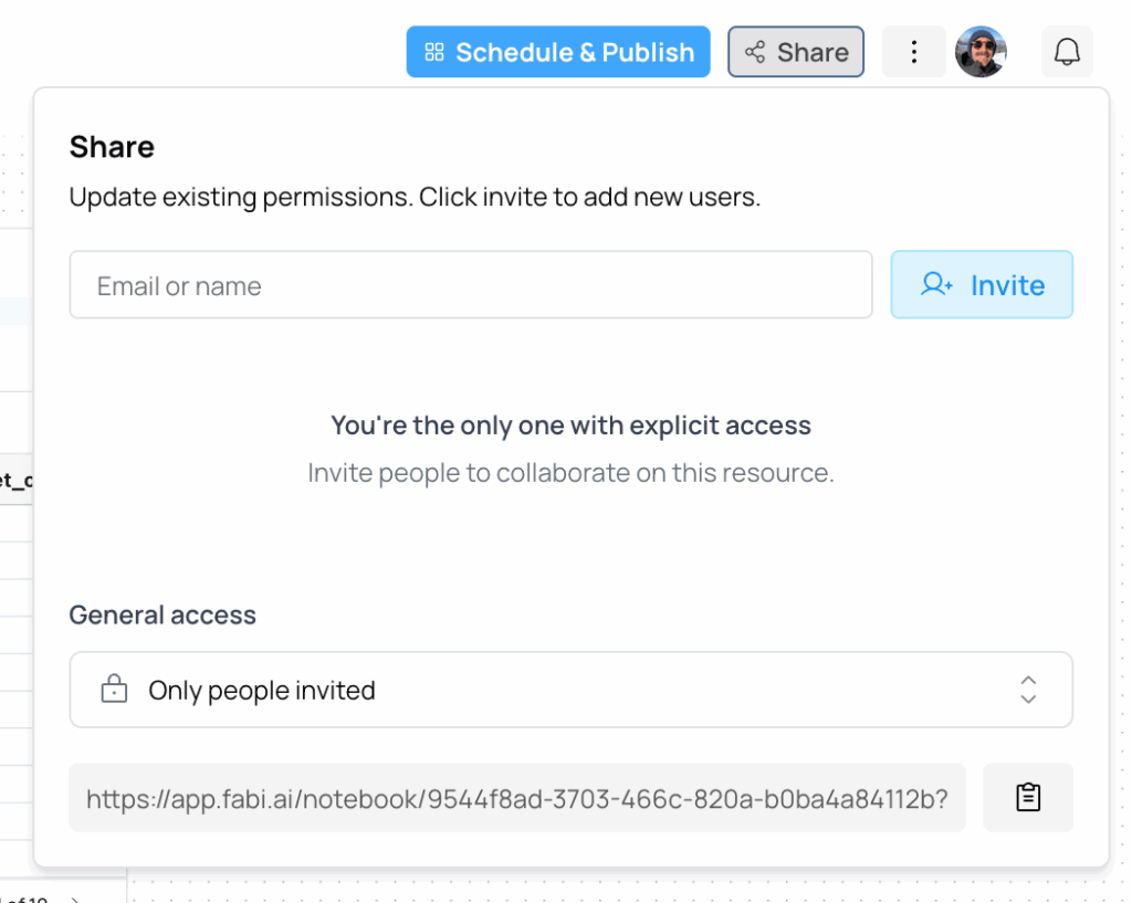
Once your analysis looks the way you want, Fabi makes it simple to share it with teammates. If you just want to share your Smartbook as-is, click Share, enter your teammates’ email addresses, and invite them to view your analysis directly in Fabi:
If you want something cleaner, you can publish your Smartbook as a dashboard. Here’s how:
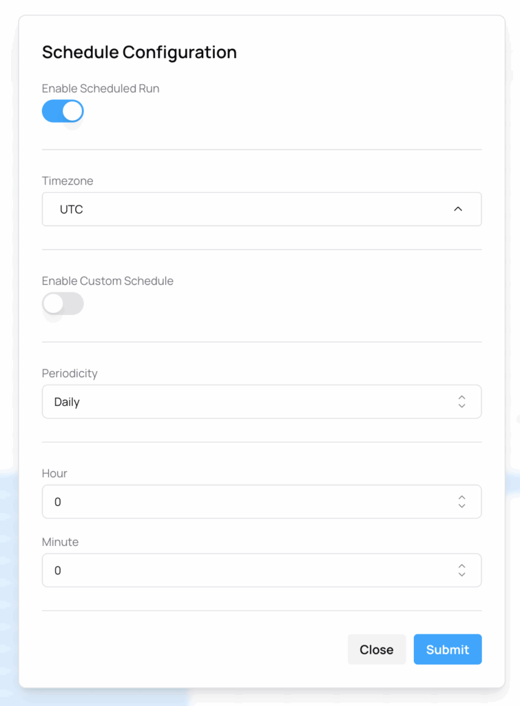
- Click Schedule and Publish

- You’ll enter a staging view where you can rearrange your charts, hide tables, resize visualizations, and add text blocks or notes
- Once it looks right, set a schedule (hourly, daily, weekly, or monthly) for Fabi to refresh the data automatically
When you’re done, click Finish and View Report. Your dashboard is now live and shareable:
Beyond dashboards, Fabi lets you automate more advanced reporting workflows. You can,
- Send AI-generated summaries to Slack or email
- Push data back into Google Sheets for your finance or customer success teams
- Use scheduled refreshes to keep internal reports up to date without manual queries
It’s a great setup for founders of small teams who want real-time visibility into their product and user behavior without maintaining complex analytics pipelines.
Wrapping Up
And that’s it. With Fabi, you don’t need to spin up a separate BI tool or write long SQL scripts. You can connect your Neon data and start creating dashboards and reports with AI data analysis right away. If you’d like to follow along step by step, watch the full video tutorial.